Tuesday, April 12, 2011

Sweet

The tiny hint of violet on this tile is so faint, it almost isn't even there.

Image courtesy of Tile of Spain


Just a little touch of an amethyst haze... Cold and clear. 

Acif Sweet -- Image courtesy of Ceramic Tiles of Italy


 ...sì, è molto dolce

Monday, March 21, 2011

Religion

What I saw at Coverings, part 2:

OK. I've had to change gears a bit today and get back into Hesiod's Theogony, which explains the birth of the gods, and even offers one of the first histories of literary criticism. (Don't ask, you wouldn't want to get me started on THAT topic.)

It can be hard to shift gears from tile to poetry... oh, who am I kidding.... I just lump it all together.

Anyway, when I came across this link about Jesus on a tile yesterday, I had to laugh. (My personal opinion is that the son of God would have chosen a nicer quality tile.) The universe seems to always provide a method for synthesis.

And antithesis...
Bon Ton Handmade Tile
 Sing Muse!

Sunday, March 20, 2011

Dynamics

Well, I’ve been back from Coverings for a few days now, and I’ve had a chance to catch up on my sleep and to think a bit about all the beautiful tiles I saw while I was there. The show is always a sensory overload situation for me, and it usually takes a few days to digest the massive quantities of information I gather. This year, Coverings was held in Las Vegas, so it was even more overstimulating than usual--but in a good way. ;)

So, what was new at Coverings? ...OK, where do I start? (This is going to take multiple posts.)

Last night’s larger-than-usual moon was one inspiration for tonight’s post.
InterStyle Glass Tile
The image above is two very large slabs of glass which could be used as cabinet doors or counter tops. 

The moon’s a sword of keen, barbaric gold,
Plunged to the hilt into a pitch black cloud.

From Mid-March by Lizette Woodworth Reese 

I was thinking about the moon’s influence on the tides and it occurred to me that I saw a lot of wave patterns in tile this year. 


Stone mosaics from the Walker Zanger Showroom
There were relief tiles--even more than previously--yet the hard geometric shapes of past years seem to have given way to softer forms, such as circles and curves. In case you were wondering how to make cement look sexy, I couldn't take my hands of this new line:

Dimensional cement tile
These small ceramic dots were hard to stop touching, too.
Walker Zanger showroom


It’s a beautiful world, you said,
with these trees, marshes, deserts,
grasses, rivers and seas

and so on. And the moon is really something
in its circuits
of relative radiance. 
from Light-Years by Hester Knibbe


Sicis glass mosaic "Nude"

Eddies and swirls were a theme
There’s something so permanent about a tile wall, and yet, the flowing lines of swirls, circles and waves counterbalance this solidity and permanence by creating movement and giving the surface life. 

 
... life, light, and energy. Which I guess was something of a theme for a journey to Vegas...
:)


Thursday, March 10, 2011

Friends

Or, Why I'm Excited to Attend Coverings--Part 2

One of the best parts of going to the same tile trade show for ten years is that I've made some great friends in the industry. In addition to all the tile manufacturers and artisans, many designers, architects, editors, PR folks, and bloggers attend the show.

The Tile of Italy Pavilion
I'm very excited that I'll get to see Jorge Aguayo, Janet Arden, Patti Fasan, Laurie Lyza, Karen Gustafson, Bill Buyok, Wilhem Stephens, Kristin Powers, Karim, and Nawal Motawi, all of whom I've known for a long time. Also, my relatively new friends, Paul Anater, JoAnn Locktov, Christine Whittemore, Lee Harris Nicholson and I are having a tweetup on Monday. (OK, the Oscars-speech part of the post is over. You can wake up now.)

Another reason I love going to Coverings is to discover new tile lines, new technologies, and new industry contacts. It's a lot of work and a lot of fun, too.

Today, I received the itinerary for the press tour, and it looks like it will be another show loaded with information and gorgeous tile. The various tile pavilions have invited us for press conferences, booth tours and meals. It's an international group, so many languages are spoken at Coverings. Plus, the Italian Pavilion always has wonderful espresso, Tiles of Spain makes tapas and paella, and there's invariably wine representing tile regions from all over the world. What's not to like?

Glass Windows by Trikeenan Tileworks

If you're attending Coverings and you'd like to meet me, post a comment (they're moderated,) or you can DM me on Twitter. I hope to see you there!

Sunday, February 20, 2011

Why I'm excited to go to Coverings, part 1

Here is a lovely mosaic design by the divine Sara Baldwin:

Weeping willow design
If you're a long-time reader of my blog, by now you already know that Sara is the founder of New Ravenna Mosaics and Stone, and that I think Sara is extremely talented. What you may not know is that last year at the Art Tile Party, between her rock band's sets, she tried to convince me to start a band of my own. I'm still laughing about that idea, although the concept of trying something completely radical has stuck with me. (I'll get back to you on how that will manifest itself, after I figure it out.)

Sara is brave and I admire that about her. In addition to starting her own company and band, she's kissed a camel and can even get away with wearing a mosaic mini-dress. I'm pretty sure that qualifies her as a tile rock star.

Next month, at Coverings, I'm hoping to see Sara and her latest mosaic creations!

Wednesday, February 16, 2011

Starry night

It was another great night for a walk, and the stars were out...
Infinity

Which reminded me of this cool glass and porcelain tile by GranitiFiandre.

And a quote by Antoine de Saint-Exupéry:
Les gens ont des étoiles qui ne sont pas les mêmes. Pour les uns, qui voyagent, les étoiles sont des guides. Pour d'autres elles ne sont rien que de petites lumières. Pour d'autres qui sont savants elles sont des problèmes. Pour mon businessman elles étaient de l'or. Mais toutes ces étoiles-là se taisent. Toi, tu auras des étoiles comme personne n'en a...
If you're having trouble imagining a whole floor of this, let me help you:
Jewel Collection by GranitiFiandre
These tiles come in sizes up to 24' x 24" and are available in four colors: Eclipse, Gem, Infinity, and Shine.

Bonne nuit et faites de beaux rêves!

Tuesday, February 15, 2011

Bravery encore

A couple of weeks ago I wrote about bravery in making a commitment to tile. Making the right choice is obviously very important, since tile has the potential to last indefinitely.

Byzantine mosaic floor
This 1,500-year old mosaic was recently discovered at Hirbet Madres on the Judean Hills in Israel. These tiny tessarae represent foxes, lions, fish, and peacocks--like the one shown here. Originally, archeologists assumed the structure was a synagogue, but after the excavation revealed stones carved with crosses, they realized that it was actually a church.

About eight years ago, a friend of mine installed some very intense 2" x 2" encaustic tiles in her kitchen. I wrote an article about her house the following year. Although the editor changed my copy, making the article rather inarticulate, I thought the images were great. Here's a close up:

English encaustic tiles from a now-defunct factory

Pretty cool, huh? They wouldn't work for everybody, but my friend is very creative and these suit her fun personality and her art-filled home. It seems to me that choosing these tiles was a brave thing to do. Here they are in-situ:


Faux-mosaic

That isn't actually a mosaic over the stove, it's a painting by her aunt, who happens to be a famous author. (Yes, you've heard of her, and no, I won't tell. But I will give you a hint--she writes books about brave children.;)

Recently, my friend mentioned how much she still loves her backsplash. I'm very happy for her-- especially since I helped her find those tiles in the first place!

Tuesday, February 8, 2011

Purity

As you know, there are days when art, poetry, and nature take me to a happy, creative place. Then there are darker days when I just need a clean, simple place for my thoughts. On days like that, a floor like this would be perfect. (The glass curtain wall would help, too.)

Manhattan Collection by Roca Ceramica -- image from Tile of Spain

This large format porcelain is available in 18” x 18” and 24” x 24”. It comes in light and dark gray, beige, ochre and brown. All very useful for creating that minimalist floor--or blank slate--as needed.

Sunday, February 6, 2011

L'espérance

For me, green is the color of hope.

Although it was pretty cold this morning, the sun was brilliant, and on my walk, I saw the first signs of spring. There were little green buds on the ends of a few branches and the pointy tips of crocuses were sticking up out of the ground. These tiny, pale buds seem so fragile, and yet they persevere in the bitter cold. After the dreary and frigid winter we've had, it's heartening to remember that if delicate new growth can do it--so can we!

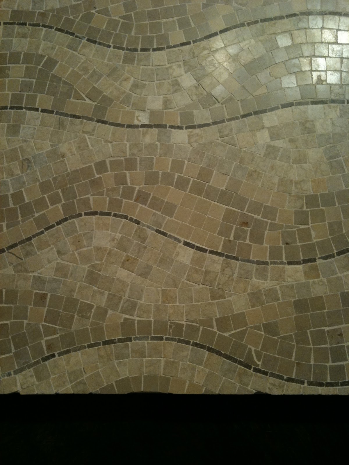
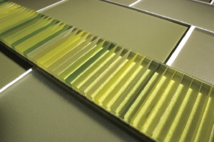
My Canadian friends at Interstyle are probably not seeing signs of spring yet, but yesterday they did send me some nice images of their Barcode glass tile line:


What I like about this tile line is the way the color changes depending on the viewer's angle and perspective. There are so many ways to see this tile. This installation image shows what I mean:

Barcode by Interstyle

A couple of weeks ago I spent some time enjoying a Frank Stella painting at the NC Museum of Art.
Since then, I've been reading about the Color Field artists of the 60s and 70s.
Stella - Sunset Beach - 1967

Noland - Graded Exposure
These Minimalist artists were pushing back against the sensual emotionalism of the Expressionist movement. Some of the Color Field painters were focused on the use of color as a pure optical experience, devoid of meaning. Their cool disengagement is interesting, and at the same time, the compositions are aesthetically pleasing. Despite their deliberate detachment, to me, the colors they've chosen seem to express joy.

Perhaps it's because Interstyle named all the Barcode colorways after fish, but this particular tile reminds me of a river, which brings to mind a poem I like by Samuel Menashe:

     At the edge
     Of a world
     Beyond my eyes
     Beautiful


     I know Exile
     Is Always
     Green with hope--
     The river
     We cannot cross
     Flows forever 

Which reminds me of yet another artist from the Minimalist movement, Larry Poons.

Poons - Vespers - 1979
These same pale greens in the tile, and in the center of the Poons, are the shades I noticed heralding spring's imminent arrival this morning.

Speaking of new growth represented by tile, this tile looks like the unfurling of a fiddlehead fern. (Yes, I know it's supposed to be an acanthus, but humor me.)

A dear friend, Lilyan, in Guatemala makes these beautiful tiles:

Topis Tile available at Wholesale Tile by Aguayo

 See what I mean?
Fiddlehead Fern
 OK, so here's the acanthus and you can decide:

William Morris wallpaper

Another tile artist, Linda Ellett, of L'esperance Tile Works in New York, sent me an image of a new installation this week. I love the richness of the blue-green glaze and how there's a range of color across each of the field tiles. I'd like to think that the sun is rising on this backsplash.

L'esperance Tile Works
As Alexander Pope said, "Hope springs eternal."

Sunday, January 30, 2011

Bravery

Recently, a colleague asked me about choosing a tile for her kitchen backsplash, so I rattled off a few tile places for her to check out. The next day, she came back and told me how much she had loved the colorful, hand painted tiles on the Avente Tile website.

Birds and Nests

Although she expressed an interest in getting beautiful tile, she said her husband was pushing for white subway tile. He was worried that if she chose something that wasn't plain, she’d get tired of it. Yet, she didn’t seem enthusiastic about going with something ordinary.

So that got me thinking… Why would she get tired of a beautiful tile that she loved, but not get tired of one she didn’t care much about to begin with? What is the thought process around this idea? Isn’t this why rentals are always painted beige—something that neither delights nor dismays?

There are people who truly love beige and subway tiles, and by all means, they should go for it. But I worry that many people choose these options because of a fear of commitment. Perhaps, if they go with the easy—the least common denominator—it feels safer than taking a stand and choosing something unusual?
Nothing wrong with this--as long as you love it.
Still, wouldn’t it be more likely that if my colleague picked what she really wanted, she’d wind up happier in the long run?

We discussed this today, and she wondered about trendiness in making her selection. It's a valid concern, but in my opinion, it's pretty easy to spot trends—they are the designs and colors that become very popular all at once. (Uh, like subway tile, for example...)

The styles that are unique and timeless are the ones that speak to the individual heart—a preference based on what truly makes one happy. Perhaps it takes bravery to make that decision, but to me, picking a tile that you love seems the safest option.

Bird of My Heart -- 6" x 7"

[OK, subway tile lovers, see the comment box? Go on, let me have it.... ]

Saturday, January 29, 2011

Blue Moods

Two days ago, while on a walk, I was struck by this amazing winter sky:

Infinity
It reminded me of the light blue cement tiles that were so popular in Florida years ago. They had just a hint of white, wispy pigment--like smoke winding on the surface--and I even think they were called "clouds" or "nubes". I'm not sure why they appealed to me so much, but I always liked the idea of floors that looked like the sky.

At this point, my walk turned to thoughts of tile, and it occurred to me that I haven't dealt with color as a topic for this blog. Our culture tends to associate certain colors with emotions and this concept fascinates me because sometimes the connections seem quite random. Other times, depending on the context, they make perfect sense. So, with the beautiful sky as my inspiration, this seems like an appropriate time to show you some blue tiles that I like.

This dark blue porcelain would be peaceful and soothing in a bedroom. The surface of this tile seems to change color depending on the light. Right now, the room where I sleep is painted a navy/plum color and although it can be somber, I enjoy the darkness it provides.

Atlas Concorde -- Plentitude -- Blue Avio
30.5 cm x 91.5 cm white body wall tile

The color blue is often associated with melancholy. Picasso's famous blue period depicts the emotion perfectly. From 1901 to 1904, he used a predominantly blue palette to express themes of hardship and misery.

La repasseuse, Pablo Picasso
Paris, spring 1904. Oil on canvas
Solomon R. Guggenheim Museum, New York 

I get why the woman looks so sad--I hate ironing too. But blue doesn't have to connote angst or despair. The sky on my walk was certainly a mood booster, for example.

Here's a cheerful bathroom in gorgeous shades of blue from Tile of Italy:

Miss Fap -- extra glossy white body porcelain
rectified 30.5 cm x 91.5 cm

Color theory is pretty complex, and I'll write about it more in another post. In the meantime, I hope that my musings on the color blue lifted your spirits today. :)

Monday, January 24, 2011

Simplicity and Complexity

As you know, I'm a big fan of art tile. There's something about each individual tile being made by hand, and a noticeable lack of perfection, that really appeals to me.

Boneyard Brick by Trikeenan in Smoke, Coldfront and Frost
Speaking of smoke, this one blew me away because it looks so sculptural and twisted:

Zima by Artistic Tile
Although my past few posts have dealt with decorative tiles, I also appreciate the simplicity of a well-crafted field tile.
Muse by Oceanside Glasstile

This last one seems as if it would be dull because of the dark color, but the way the light reflects off the textured surface makes it fascinatingly complex. 

Saturday, January 22, 2011

Tree Tile

Last night I posted about the moon. Later, it occurred to me that there's another moon tile that I'd like to share. This one by tile artist, Nawal Motawi--

Marsh

Nawal and her brother Karim are very cool tile friends of mine, and although Karim isn't involved in the business any longer, they worked together for years. 

Nawal at work on a mural

These tree tiles remind me of the Pacific Northwest. They are so sublime and lovely that people frame individual tiles to hang as art.

Pine Landscape

According to the Motawi website, "The designs are brought to life by a tile-making process which is a journey itself.... The artful tile—the outcome of this shared obsession—is evidence that this duo and their artisan team is at the top of their craft."

No kidding. This is some seriously beautiful tile!
Pine Landscape Mountain
Happy Tu B’Shevat!

Full Circle

Lately, I've been thinking about circles... Maybe the influence is the beautiful full moon tonight?

On my phone, I have the simplest, zen-like game. Basically, you just try to draw a perfect circle with your finger. After each attempt, the game gives you a score. Drawing a perfect circle is much harder than it seems and takes patience and concentration.

Sara Baldwin designs the most gorgeous glass mosaics. This pattern is from New Ravenna for Ann Sacks
Today, in a moment of tedium, I was able to find a peaceful place by drawing a few circles with a pencil, ultimately connecting them. Naturally, I began to think of circle tiles that I especially like.

This nineteenth-century drawing depicts the mosaic floors as they existed in St. Denis cathedral in the twelfth-century. The interlocking circle pattern on the right is from the Chapelle de la Vierge.

From the Dictionnaire raisonné de l’architecture française du XIe au XVIe siècle

Speaking of historical tile, this majolica design comes from the late fifteenth-century della Robbia workshop, and is from the Loggias of Raphael in the Vatican. The Borgia Pope, Alexander VI most likely imported the taste for Moorish patterns from Spain.


Of course, I'm not completely obsessed with history. There are some cool contemporary tile artists making circle tiles too.

Here's a groovy one by another one of my tile friends, Mary Anderson of Bon Ton Tile in Minnesota:

Disqueo

And finally, one last tile, also by Mary Anderson:


And that brings us... 
you know---

Sunday, January 16, 2011

Peaceful Tile


For Leah Zahavi, the path to becoming a tile artist has been an inspiring journey. Her history as an artist informs her tile work, enriching it with texture, meaning and beauty. 

Inner Piece - Single Red Flower

Zahavi began her path to tile, first as a fiber artist and then as a university art instructor. Later, she was a museum curator and educator for a Tibetan museum. In addition, because her mother is the internationally recognized mosaic artist Ilana Shafir, Zahavi was exposed to the world of mosaics. 

“As an artist myself, I realized that the materials available to mosaic artists seemed rather limited," said Zahavi. "I felt that I could expand the textures and patterns of their mosaics. So I decided to create a line of inspiration pieces that mosaic artists could use.”


Zahavi got feedback from several mosaic artists who had purchased her pieces, but didn’t have the heart to break them for use in their own work. So she came up with the slogan “If it ain’t broken, break it!” But despite her encouragement, Zahavi still found that her work sat on other artists’ windowsills--intact. Eventually, she decided to start a tile line of her own
Inner Piece - Rippling Waters

Zahavi uses her skills as a textile designer to create patterns, ornamental forms, and imagery in clay. She also often employs the structure of a Mandala, which has a concentric composition with tightly balanced geometric shapes and a ring of protection. “Tibetan Buddhists believe that Mandalas transmit a positive energy to the environment and to the people who view them,” she explains. 

Inner Piece - Sunset


Thus, she named her line “Inner Piece” because it is evocative of “peace” and yet, is only part of the larger structure. Says Zahavi, “I like the idea that my tiles can enhance the environment, spiritually and aesthetically.”