Showing posts with label interstyle. Show all posts

Sunday, March 20, 2011

Dynamics

Well, I’ve been back from Coverings for a few days now, and I’ve had a chance to catch up on my sleep and to think a bit about all the beautiful tiles I saw while I was there. The show is always a sensory overload situation for me, and it usually takes a few days to digest the massive quantities of information I gather. This year, Coverings was held in Las Vegas, so it was even more overstimulating than usual--but in a good way. ;)

So, what was new at Coverings? ...OK, where do I start? (This is going to take multiple posts.)

Last night’s larger-than-usual moon was one inspiration for tonight’s post.
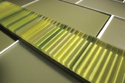
InterStyle Glass Tile
The image above is two very large slabs of glass which could be used as cabinet doors or counter tops. 

The moon’s a sword of keen, barbaric gold,
Plunged to the hilt into a pitch black cloud.

From Mid-March by Lizette Woodworth Reese 

I was thinking about the moon’s influence on the tides and it occurred to me that I saw a lot of wave patterns in tile this year. 


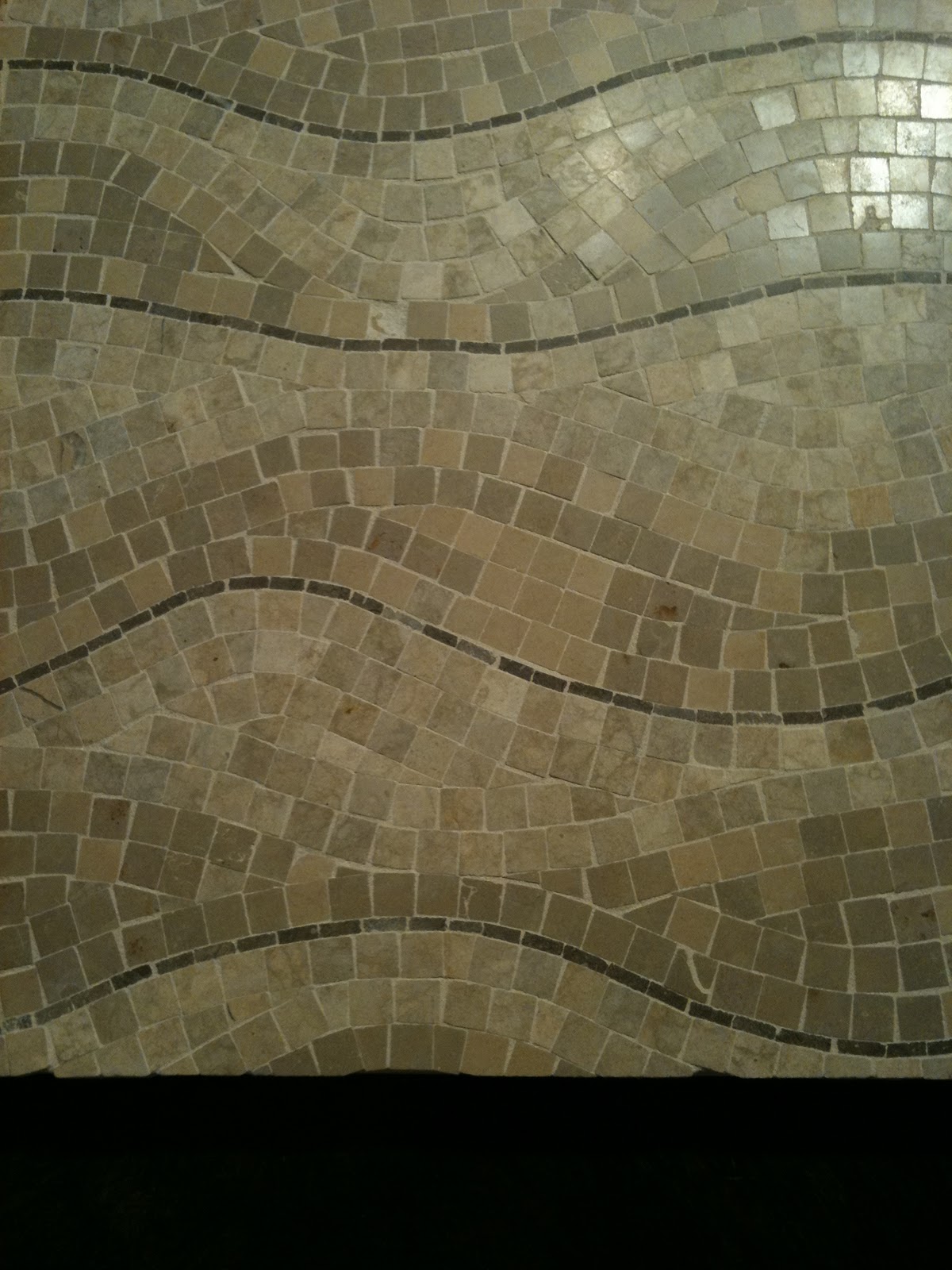
Stone mosaics from the Walker Zanger Showroom
There were relief tiles--even more than previously--yet the hard geometric shapes of past years seem to have given way to softer forms, such as circles and curves. In case you were wondering how to make cement look sexy, I couldn't take my hands of this new line:

Dimensional cement tile
These small ceramic dots were hard to stop touching, too.
Walker Zanger showroom


It’s a beautiful world, you said,
with these trees, marshes, deserts,
grasses, rivers and seas

and so on. And the moon is really something
in its circuits
of relative radiance. 
from Light-Years by Hester Knibbe


Sicis glass mosaic "Nude"

Eddies and swirls were a theme
There’s something so permanent about a tile wall, and yet, the flowing lines of swirls, circles and waves counterbalance this solidity and permanence by creating movement and giving the surface life. 

 
... life, light, and energy. Which I guess was something of a theme for a journey to Vegas...
:)


Sunday, February 6, 2011

L'espérance

For me, green is the color of hope.

Although it was pretty cold this morning, the sun was brilliant, and on my walk, I saw the first signs of spring. There were little green buds on the ends of a few branches and the pointy tips of crocuses were sticking up out of the ground. These tiny, pale buds seem so fragile, and yet they persevere in the bitter cold. After the dreary and frigid winter we've had, it's heartening to remember that if delicate new growth can do it--so can we!

My Canadian friends at Interstyle are probably not seeing signs of spring yet, but yesterday they did send me some nice images of their Barcode glass tile line:


What I like about this tile line is the way the color changes depending on the viewer's angle and perspective. There are so many ways to see this tile. This installation image shows what I mean:

Barcode by Interstyle

A couple of weeks ago I spent some time enjoying a Frank Stella painting at the NC Museum of Art.
Since then, I've been reading about the Color Field artists of the 60s and 70s.
Stella - Sunset Beach - 1967

Noland - Graded Exposure
These Minimalist artists were pushing back against the sensual emotionalism of the Expressionist movement. Some of the Color Field painters were focused on the use of color as a pure optical experience, devoid of meaning. Their cool disengagement is interesting, and at the same time, the compositions are aesthetically pleasing. Despite their deliberate detachment, to me, the colors they've chosen seem to express joy.

Perhaps it's because Interstyle named all the Barcode colorways after fish, but this particular tile reminds me of a river, which brings to mind a poem I like by Samuel Menashe:

     At the edge
     Of a world
     Beyond my eyes
     Beautiful


     I know Exile
     Is Always
     Green with hope--
     The river
     We cannot cross
     Flows forever 

Which reminds me of yet another artist from the Minimalist movement, Larry Poons.

Poons - Vespers - 1979
These same pale greens in the tile, and in the center of the Poons, are the shades I noticed heralding spring's imminent arrival this morning.

Speaking of new growth represented by tile, this tile looks like the unfurling of a fiddlehead fern. (Yes, I know it's supposed to be an acanthus, but humor me.)

A dear friend, Lilyan, in Guatemala makes these beautiful tiles:

Topis Tile available at Wholesale Tile by Aguayo

 See what I mean?
Fiddlehead Fern
 OK, so here's the acanthus and you can decide:

William Morris wallpaper

Another tile artist, Linda Ellett, of L'esperance Tile Works in New York, sent me an image of a new installation this week. I love the richness of the blue-green glaze and how there's a range of color across each of the field tiles. I'd like to think that the sun is rising on this backsplash.

L'esperance Tile Works
As Alexander Pope said, "Hope springs eternal."

Wednesday, April 15, 2009

Glass tile


Glass tile: It's not just for pool surrounds anymore.

Considering that glass has been around for thousands of years, it is amazing how much progress has been made in glass tile manufacturing in the last ten years.

As you can see from this beautiful example from Interstyle, glass tile can be seen in just about any size, color, texture or finish imaginable and it can be used pretty much anywhere ceramic tile is appropriate.

According to Patricia Hart McMillan, coauthor of Glass Tile Inspirations for Kitchens & Baths. "As an interior designer, I appreciate the gloriously unique light-refracting quality of glass tile that adds an exciting liveliness unmatched by any other surface material. One manufacturer described the interaction one has with glass tile as 'dancing with the light'."

"I am thrilled with the variety of glass tile, so that there is a color, texture, finish and size (or combination of sizes and shapes) appropriate for any and every interior style and period," says McMillan.