Showing posts with label tile. Show all posts

Wednesday, February 16, 2011

Starry night

It was another great night for a walk, and the stars were out...
Infinity

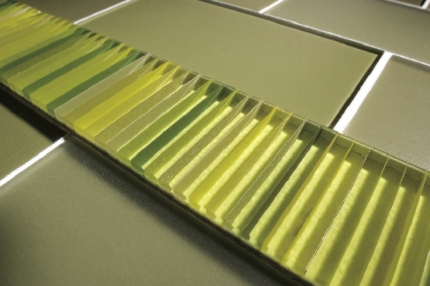
Which reminded me of this cool glass and porcelain tile by GranitiFiandre.

And a quote by Antoine de Saint-Exupéry:
Les gens ont des étoiles qui ne sont pas les mêmes. Pour les uns, qui voyagent, les étoiles sont des guides. Pour d'autres elles ne sont rien que de petites lumières. Pour d'autres qui sont savants elles sont des problèmes. Pour mon businessman elles étaient de l'or. Mais toutes ces étoiles-là se taisent. Toi, tu auras des étoiles comme personne n'en a...
If you're having trouble imagining a whole floor of this, let me help you:
Jewel Collection by GranitiFiandre
These tiles come in sizes up to 24' x 24" and are available in four colors: Eclipse, Gem, Infinity, and Shine.

Bonne nuit et faites de beaux rêves!

Tuesday, February 15, 2011

Bravery encore

A couple of weeks ago I wrote about bravery in making a commitment to tile. Making the right choice is obviously very important, since tile has the potential to last indefinitely.

Byzantine mosaic floor
This 1,500-year old mosaic was recently discovered at Hirbet Madres on the Judean Hills in Israel. These tiny tessarae represent foxes, lions, fish, and peacocks--like the one shown here. Originally, archeologists assumed the structure was a synagogue, but after the excavation revealed stones carved with crosses, they realized that it was actually a church.

About eight years ago, a friend of mine installed some very intense 2" x 2" encaustic tiles in her kitchen. I wrote an article about her house the following year. Although the editor changed my copy, making the article rather inarticulate, I thought the images were great. Here's a close up:

English encaustic tiles from a now-defunct factory

Pretty cool, huh? They wouldn't work for everybody, but my friend is very creative and these suit her fun personality and her art-filled home. It seems to me that choosing these tiles was a brave thing to do. Here they are in-situ:


Faux-mosaic

That isn't actually a mosaic over the stove, it's a painting by her aunt, who happens to be a famous author. (Yes, you've heard of her, and no, I won't tell. But I will give you a hint--she writes books about brave children.;)

Recently, my friend mentioned how much she still loves her backsplash. I'm very happy for her-- especially since I helped her find those tiles in the first place!

Sunday, February 6, 2011

L'espérance

For me, green is the color of hope.

Although it was pretty cold this morning, the sun was brilliant, and on my walk, I saw the first signs of spring. There were little green buds on the ends of a few branches and the pointy tips of crocuses were sticking up out of the ground. These tiny, pale buds seem so fragile, and yet they persevere in the bitter cold. After the dreary and frigid winter we've had, it's heartening to remember that if delicate new growth can do it--so can we!

My Canadian friends at Interstyle are probably not seeing signs of spring yet, but yesterday they did send me some nice images of their Barcode glass tile line:


What I like about this tile line is the way the color changes depending on the viewer's angle and perspective. There are so many ways to see this tile. This installation image shows what I mean:

Barcode by Interstyle

A couple of weeks ago I spent some time enjoying a Frank Stella painting at the NC Museum of Art.
Since then, I've been reading about the Color Field artists of the 60s and 70s.
Stella - Sunset Beach - 1967

Noland - Graded Exposure
These Minimalist artists were pushing back against the sensual emotionalism of the Expressionist movement. Some of the Color Field painters were focused on the use of color as a pure optical experience, devoid of meaning. Their cool disengagement is interesting, and at the same time, the compositions are aesthetically pleasing. Despite their deliberate detachment, to me, the colors they've chosen seem to express joy.

Perhaps it's because Interstyle named all the Barcode colorways after fish, but this particular tile reminds me of a river, which brings to mind a poem I like by Samuel Menashe:

     At the edge
     Of a world
     Beyond my eyes
     Beautiful


     I know Exile
     Is Always
     Green with hope--
     The river
     We cannot cross
     Flows forever 

Which reminds me of yet another artist from the Minimalist movement, Larry Poons.

Poons - Vespers - 1979
These same pale greens in the tile, and in the center of the Poons, are the shades I noticed heralding spring's imminent arrival this morning.

Speaking of new growth represented by tile, this tile looks like the unfurling of a fiddlehead fern. (Yes, I know it's supposed to be an acanthus, but humor me.)

A dear friend, Lilyan, in Guatemala makes these beautiful tiles:

Topis Tile available at Wholesale Tile by Aguayo

 See what I mean?
Fiddlehead Fern
 OK, so here's the acanthus and you can decide:

William Morris wallpaper

Another tile artist, Linda Ellett, of L'esperance Tile Works in New York, sent me an image of a new installation this week. I love the richness of the blue-green glaze and how there's a range of color across each of the field tiles. I'd like to think that the sun is rising on this backsplash.

L'esperance Tile Works
As Alexander Pope said, "Hope springs eternal."

Sunday, January 30, 2011

Bravery

Recently, a colleague asked me about choosing a tile for her kitchen backsplash, so I rattled off a few tile places for her to check out. The next day, she came back and told me how much she had loved the colorful, hand painted tiles on the Avente Tile website.

Birds and Nests

Although she expressed an interest in getting beautiful tile, she said her husband was pushing for white subway tile. He was worried that if she chose something that wasn't plain, she’d get tired of it. Yet, she didn’t seem enthusiastic about going with something ordinary.

So that got me thinking… Why would she get tired of a beautiful tile that she loved, but not get tired of one she didn’t care much about to begin with? What is the thought process around this idea? Isn’t this why rentals are always painted beige—something that neither delights nor dismays?

There are people who truly love beige and subway tiles, and by all means, they should go for it. But I worry that many people choose these options because of a fear of commitment. Perhaps, if they go with the easy—the least common denominator—it feels safer than taking a stand and choosing something unusual?
Nothing wrong with this--as long as you love it.
Still, wouldn’t it be more likely that if my colleague picked what she really wanted, she’d wind up happier in the long run?

We discussed this today, and she wondered about trendiness in making her selection. It's a valid concern, but in my opinion, it's pretty easy to spot trends—they are the designs and colors that become very popular all at once. (Uh, like subway tile, for example...)

The styles that are unique and timeless are the ones that speak to the individual heart—a preference based on what truly makes one happy. Perhaps it takes bravery to make that decision, but to me, picking a tile that you love seems the safest option.

Bird of My Heart -- 6" x 7"

[OK, subway tile lovers, see the comment box? Go on, let me have it.... ]

Saturday, January 29, 2011

Blue Moods

Two days ago, while on a walk, I was struck by this amazing winter sky:

Infinity
It reminded me of the light blue cement tiles that were so popular in Florida years ago. They had just a hint of white, wispy pigment--like smoke winding on the surface--and I even think they were called "clouds" or "nubes". I'm not sure why they appealed to me so much, but I always liked the idea of floors that looked like the sky.

At this point, my walk turned to thoughts of tile, and it occurred to me that I haven't dealt with color as a topic for this blog. Our culture tends to associate certain colors with emotions and this concept fascinates me because sometimes the connections seem quite random. Other times, depending on the context, they make perfect sense. So, with the beautiful sky as my inspiration, this seems like an appropriate time to show you some blue tiles that I like.

This dark blue porcelain would be peaceful and soothing in a bedroom. The surface of this tile seems to change color depending on the light. Right now, the room where I sleep is painted a navy/plum color and although it can be somber, I enjoy the darkness it provides.

Atlas Concorde -- Plentitude -- Blue Avio
30.5 cm x 91.5 cm white body wall tile

The color blue is often associated with melancholy. Picasso's famous blue period depicts the emotion perfectly. From 1901 to 1904, he used a predominantly blue palette to express themes of hardship and misery.

La repasseuse, Pablo Picasso
Paris, spring 1904. Oil on canvas
Solomon R. Guggenheim Museum, New York 

I get why the woman looks so sad--I hate ironing too. But blue doesn't have to connote angst or despair. The sky on my walk was certainly a mood booster, for example.

Here's a cheerful bathroom in gorgeous shades of blue from Tile of Italy:

Miss Fap -- extra glossy white body porcelain
rectified 30.5 cm x 91.5 cm

Color theory is pretty complex, and I'll write about it more in another post. In the meantime, I hope that my musings on the color blue lifted your spirits today. :)

Monday, January 24, 2011

Simplicity and Complexity

As you know, I'm a big fan of art tile. There's something about each individual tile being made by hand, and a noticeable lack of perfection, that really appeals to me.

Boneyard Brick by Trikeenan in Smoke, Coldfront and Frost
Speaking of smoke, this one blew me away because it looks so sculptural and twisted:

Zima by Artistic Tile
Although my past few posts have dealt with decorative tiles, I also appreciate the simplicity of a well-crafted field tile.
Muse by Oceanside Glasstile

This last one seems as if it would be dull because of the dark color, but the way the light reflects off the textured surface makes it fascinatingly complex. 

Monday, May 3, 2010

Creative Reuse


Well, I'm only partially recovered from last week's tile and stone extravaganza. With hundreds of tile manufactures to visit, Coverings is always overwhelming. It usually takes me a few days to process all that I've seen (and for my feet to stop hurting). I'm going to post a few of my favorite finds over the next few days.

One product that stood out was this re purposed antique tile from LTS Ceramics in West Palm Beach. They actually take the old tile and slice it to make thin pieces and then create mosaics using the fronts and backs of the tile. They also mix in stone, too. The results are beautiful and unique.

Depending on the tiles used and the patterns created, the mosaics are vastly different in tone. One is classical, one whimsical, one artistic.

I suppose this product could be considered the ultimate in recycling.

Tuesday, April 27, 2010

Coverings 2010

Coverings will be opening shortly and I'll be there, scouting all the newest and coolest tiles. Check back in a couple of days for updates on all the trends!

Friday, April 16, 2010

Porcelain that looks like concrete


Inalco, a tile of Spain branded manufacturer, has just released their "Sensations" collection. Among the new releases is "Concrete" which uses "environmental materials in their purest state," according the the press release.  I'm not sure what that means, but it sounds good. This large format tile is 23.6" x 23.6" and comes in neutrals, grey and white (shown here.)

Obviously, this is a gorgeous installation. I'm wondering though, what do you think about using a high-tech product to replicate a low-tech one?

Tuesday, April 6, 2010

What not to do

Recently, a tile company sent me this image of their tile, hoping that I might promote it in one of my articles or perhaps even on this blog.  In any given week, I might get dozens of press releases, and I always enjoy seeing what's new in tile.

This image however, is the perfect example of what not to do. The decorative pieces aren't horrible, I don't love the field tile, but the installation--shudder! Would it really have been so difficult to drop the center panel a couple of inches?

Last month, I was asked in an interview to give one piece of advice to someone tiling their home. I said, "Hire a qualified installer!" Here is the perfect example of why that is so important.

Friday, August 28, 2009

Ultra-Thin Technical Porcelain

For several years, tiles have been getting larger and larger. This year, several manufacturers have introduced ultra-thin, high-performance, large-format porcelain tile. These tiles are very light, minimizing transportation burdens and reducing installation costs, which is great for the environment.

Here are some of the new introductions:

SlimmKer by Inalco is 4 mm thick porcelain, available in 18” x 35.” It is easy to cut or perforate, and is lightweight. A new anchorage system allows for easy replacement, reducing landfill waste and demolition mess.

Ceramiche Ceasar offers large format porcelain, 3m x 1m and only 4.6 mm thick, mounted on fiberglass, with 40% recycled content.

Lea North America introduced SlimTech, a 3mm thick tile. According to Cesare Cabani, "The tile has all certifications for eco you could possibly get." Slimtech is the result of a rolling and compression technology, which totally modifies the traditional production process, the tile is extremely resistant, easy to install and flexible.

Provenza's EcoMood is a very thin tile for walls and floors with texture available in large format. It consists of 40% certified recycled content.

Kerlite by Cotto D'Este offers a range of colors and sizes in 3mm thick porcelain tile for interior and exterior cladding. Optional fiberglass backing adds one half millimeter to the thickness. The tiles are available up to 3m x 1m.

Thursday, August 13, 2009

Villa Lagoon Tiles


These cement tiles were designed by Lundy Wilder, who built a hurricane-proof house in Gulf Shores, Alabama. The house survived direct hits from major hurricanes, Ivan and Katrina.

Doesn't the pattern look like a stylized representation of radar images of the eye of a hurricane with spinning clouds? Maybe that was Lundy's intention? Either way, it is a classy pattern and these tiles would look just as great outside of hurricane alley.

Monday, April 27, 2009

Tiles that should come in green, but probably won't

Several companies announced new product lines slated for late 2009 production. These tiles will use clean air technology to fight pollution. Ceracasa Tile's 'BionicTile' cleans the air by converting nitrous oxide to inert nitrates. StonePeak's new photo catalytic titanium dioxide tile uses nanotechnology to clean the air.

They both sound like a fabulous idea. If they work, let's clad all our buildings in them!

Saturday, April 25, 2009

Coverings

Well, I survived a busy week at Coverings in Chicago. It was less hectic than usual, but my impression was that the people who were there were pretty serious. There weren't as many folks there who were just looking. Manufacturers and vendors seemed happily surprised that there were a considerable amount of orders. Maybe because fewer people were there, there was less competition?

I'll be posting images later this week, so stop back for a look!

Tuesday, April 14, 2009

Installing, sealing and cleaning cement tile

"For installation, I'd rather see a stonemason install these tiles than a general tile contractor, because the installation method is much more like setting stone," says Jorge Aguayo, of Aguayo Tile. "Butt joints and be careful sealing because the tiles are porous like stone. I would tend to think that a stonemason would do a better job, unless the tile installer had a lot of experience specifically with cement tile."

Michael Dowd, owner of Paramount Tile in Ft. Lauderdale Florida agrees, "Stone setters understand cement tiles because they are very similar to stone. You have to allow for natural variation of the depth of the tile, use a mud setting, and the sealing processes are similar. Also, the tight grout joint is crucial."

Wilhem Stevens from Original Mission Tile says, "The tiles should be installed on a level and stable cured concrete surface. Water cut the tiles and use 100% coverage of thinset. The grout joint recommended is 1/16" to 1/8."

According to Suzette Dávila, a distributor in Puerto Rico, cement tile is very easy to clean. “You just clean with water and occasionally with a neutral detergent, and that is all.”  Most people prefer this natural look but she suggests occasionally sealing and waxing for those who want a light shine.